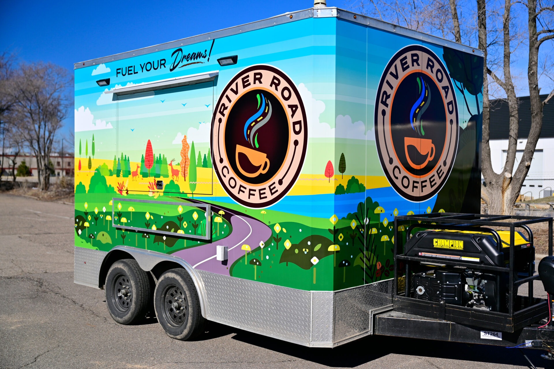
Running a concession trailer business involves more than serving great food—it’s about creating a brand experience that attracts customers and leaves a lasting impression. High-quality, well-designed graphics are the cornerstone of this strategy, transforming your trailer into a mobile billboard that not only draws attention but also communicates your brand’s essence. This article delves into the essential aspects of creating effective graphics for concession trailers, with actionable insights and answers to common questions.
Why Are Graphics Vital for Your Concession Trailer’s Success?
Graphics are the face of your concession trailer, acting as the first point of interaction between your brand and potential customers. In busy environments like food truck festivals or fairs, customers often make split-second decisions based on visual appeal. Vibrant, eye-catching designs help your trailer stand out from competitors, encouraging foot traffic and instilling confidence in your offerings.
Beyond aesthetics, graphics convey your brand identity, showcase your products, and even create emotional connections. A cohesive design can build brand recognition over time, ensuring your trailer is remembered long after customers leave.
What Elements Should Your Concession Trailer Graphics Include?
An effective design requires careful selection of key components that maximize both aesthetic appeal and functionality. Here’s what to prioritize:
1. Logo
Your logo is the heart of your brand identity. Ensure it’s prominently displayed and easily recognizable. A professional logo communicates credibility and sets the tone for your trailer’s overall aesthetic.
2. Product Images
Showcase high-quality, appetizing images of your best-selling dishes. Avoid clutter by focusing on a few key items that represent your menu, ensuring they’re visually enticing and properly lit.
3. Brand Colors
Select colors that align with your brand’s personality. Bright colors like red or yellow are great for grabbing attention, while softer pastels or earthy tones can reflect a specialty niche, such as desserts or organic foods.
4. Typography
Use bold, easy-to-read fonts for your business name, tagline, and any additional text. Avoid using more than two font styles to maintain consistency and ensure readability.
5. Contact Information
Include essential details like your website, social media handles, or phone number. This allows customers to follow your brand and stay connected for updates or promotions.
What Materials Are Best for Concession Trailer Graphics?
Choosing the right material for your trailer graphics ensures longevity and a polished look. Since trailers are exposed to various weather conditions, durability is a priority. Below are the top material options:
1. Vinyl Wraps
Vinyl wraps are the most popular choice for concession trailers. They are customizable, weather-resistant, and offer a sleek, professional finish. With full-color designs, vinyl wraps cover the entire surface of the trailer, making your graphics visible from all angles.
2. Magnetic Signs
If you prefer flexibility, magnetic signs are a good alternative. While they don’t provide full coverage, they’re removable and cost-effective, making them suitable for temporary branding or seasonal changes.
3. Perforated Vinyl for Windows
Perforated vinyl is ideal for covering trailer windows without obstructing visibility from inside. This material allows for a seamless design flow while maintaining functionality.
What Are the Best Practices for Designing Trailer Graphics?
Crafting an effective design requires a blend of creativity and strategy. Here are some best practices to guide your process:
1. Keep It Simple
Avoid clutter. Focus on the most important design elements—logo, key product images, and contact information. Simplicity ensures clarity and readability from a distance.
2. Use High-Quality Images
Blurry or pixelated images can damage your brand’s perception. Invest in professional photography or use high-resolution stock images to ensure crisp visuals that look good on large formats.
3. Consider Placement
Strategically position key elements where they’re most visible. The sides of the trailer are prime real estate for showcasing your logo and main visuals, while the back can include contact details and a call to action.
4. Ensure Consistency
Maintain uniformity in colors, fonts, and imagery. This reinforces your brand identity and makes your trailer easily recognizable across different events.
How Can You Stand Out Among Competitors?
In crowded settings, your trailer needs to grab attention and create a lasting impression. Here’s how to achieve that:
1. Highlight Unique Selling Points
Emphasize what makes your business special, whether it’s organic ingredients, gluten-free options, or signature dishes. Incorporate this message prominently in your design.
2. Incorporate Lighting
LED lighting can elevate your trailer’s visibility during evening hours. Use backlit signage or accent lighting to make your graphics pop in low-light conditions.
3. Add Interactive Features
Engage tech-savvy customers with QR codes that link to your social media, website, or menu. This encourages interaction and makes it easy for customers to share their experience.
Should You Hire a Professional Designer?
While DIY design tools are tempting, hiring a professional designer can make a significant difference. Designers bring expertise in layout, branding, and visual storytelling, ensuring your graphics are cohesive and impactful. A professionally designed trailer is an investment in your brand’s long-term success, helping you stand out and attract more customers.
How Can You Maintain Your Trailer Graphics?
To keep your graphics looking fresh and professional, follow these maintenance tips:
- Clean Regularly: Wash your trailer with mild soap and water to remove dirt and stains. Avoid abrasive materials that might scratch the surface.
- Inspect for Damage: Check for peeling or fading graphics periodically. Repair or replace damaged sections promptly to maintain a polished appearance.
- Protect from Weather: When not in use, store your trailer in a covered area or use protective covers to prevent sun and weather damage.
Conclusion
Well-designed concession trailer graphics are a powerful tool for attracting customers and building a memorable brand. By prioritizing quality, strategic design, and regular maintenance, your trailer can become a visual magnet that drives traffic and enhances your business’s reputation. Whether you choose to go DIY or hire a professional, investing in impactful graphics will pay off in customer engagement and brand recognition.


